Going to start your business… Here are the most effective Logo Design Tips and Techniques To Make Your Brand Successful in 2021.
Creating a good logo design is an art!
And a good designer knows how to make a brand successful just by designing a perfect piece of a logo (brand identity).
Being a professional logo designer, I always want to share a well communicating ‘design brief’ to my client and customers to create a logo that directly communicates with the target market.
As we are approaching to 2021, so the logo design needs to be more convincing and engaging so the customers can directly engage in business.
Effective design and branding give you the opportunity to grow by achieving goals within time.
A small piece of the image (logo) can make a big difference for your business to achieve your target.
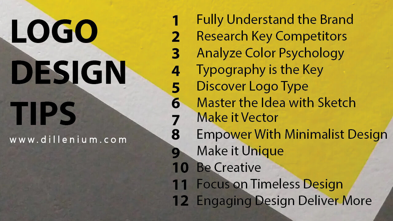
12 Creative Logo Design Tips
To Make Your Brand Successful
So here are the tips and techniques for your logo brand to make a perfect logo that directly speak to the target audience to make them engaged.
- Fully Understand the Brand
- Research Key Competitors
- Analyze Color Psychology
- Typography is the Key
- Discover Logo Type
- Master the Idea with Sketch
- Make it Vector
- Empower With Minimalist Design
- Make it Unique
- Be Creative
- Focus on Timeless Design
- Engaging Design Deliver More
1) Fully Understand the Brand
Before start designing it’s important for every designer to share a good design brief with their client to get the complete picture of the business that’s going to start.
A smartly designed ‘logo design questionnaire’ can make this job easy to get all the potential information about the business.
Being a professional designer, It’s important for me to take all the necessary information about the brand design, target market, demographic and brand reach. If you have solid information with you then it will be easy to make a stunning design.
Understanding brand ideology is also important for designers before starting a design. In this way, you will learn the complete set of attributes that the business reflects. In fact, it will help to analyze the brand personality to make an inspiring piece.
I’d like to share my best practice that varies with different clients. Many business owners are not good at providing information and they only share what they want. So if you are dealing with such clients then it’s your responsibility to communicate them properly about the importance of getting information.
I personally take information about the brand by using my logo design questionnaire that gives me a complete picture of the brand. So it becomes easy for me to start designing in the right direction to create a perfect piece of designing with less revision.
I must say, understanding brand before design will save your time and effort to create a good design that people love.
2) Research Key Competitors
Now the next phase after understanding the brand is to research their successful and failed competitors based on their target market and demographics.
Competitor analysis is important before start designing.
Making a brand is the most sensitive art that you are going to create so what the competitors are doing is important to know to create a killer brand.
As a logo designer, my strategy to analyze competitors is to make a piece of design that makes it distinguished among competitors. And, it will not achieve without delving in a competitor brand.
3) Analyze Color Psychology
Yes, it important! for every brand to communicate with effective colors according to the nature of the brand.
Understanding to integrate graphic objects with true colors is the most important part to engage the target audience.
Basically, colors play a vital role to make a decision about the brand by its audience. It gives you a vibe to become a customer :-)
So for a logo designer, it’s important to know the exact meaning of the logo brand to enhance it with true colors.
Learning color psychology is an art especially when it comes to branding.
Speaking with the true colors related to a brand can make your brand successful and if you are targeting colors that are not overwhelmed by its audience then it will be a failure.
Colors give the vibe to interact. So sensibly using the right color for the brand can make it more powerful to penetrate the market.
There are many examples and case studies of brands that people love because of attractive design and justifying colors.
Adding color doesn’t mean to make it packed with different colors without knowing the science behind it. Use the right color after knowing the brand to make it attractive and eye-catching. It adds maturity to the brand if you are using the right color.
Color basically invoke emotions and feeling. Playing with customer’s emotions using color is one of the ways to make a perfect brand.
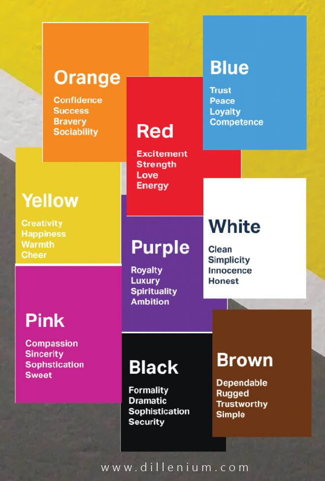
Here is some color guidance that will help to make a stunning piece based on your design brief.
RED: Mainly symbolize excitement and best to get people’s attention. Many real estate logos based on red color with the addition of black to make it eye-catching for their target market.
BLUE: Symbolize loyalty, peace, trust, and competence. One of the most adorable shade to create stunning logos.
ORANGE: One of the most used colors for brands. Clearly gives a message of being creative and enthusiastic. It gives a happy vibe so many creative and corporate organizations incorporate orange in their logo.
GREEN: Simple gives a vibe of being peaceful. Growing and healthy message communicates when you use green. Many health and fitness companies use green to represent their brand.
YELLOW: It brings vitality and warmth. Gives a sign of optimism! Many beverage and food companies incorporate yellow in their logo.
BLACK: Brings maturity and tranquility within the design.
So using the right color for a brand is the science and a good logo designer understands the psychology of the target audience to make it engaging.
4) Typography is the Key
Another important logo design tip is to incorporate the right typography within the design. Playing with typefaces to make a brand more mature and engaging is the key.
Be remember, the powerful design speaks with the right font.
It doesn’t mean to use the fancy or pretty font in your design. It means to add a simple, readable, and attractive font to your logo brand based on the business niche that people can easily memorize to recall your brand.
In 2021, adding lettering is one of the most important ways to make a brand.
Here you can go through the most recommended ‘logo design font’ that you can use to add value.
5) Discover Logo Type
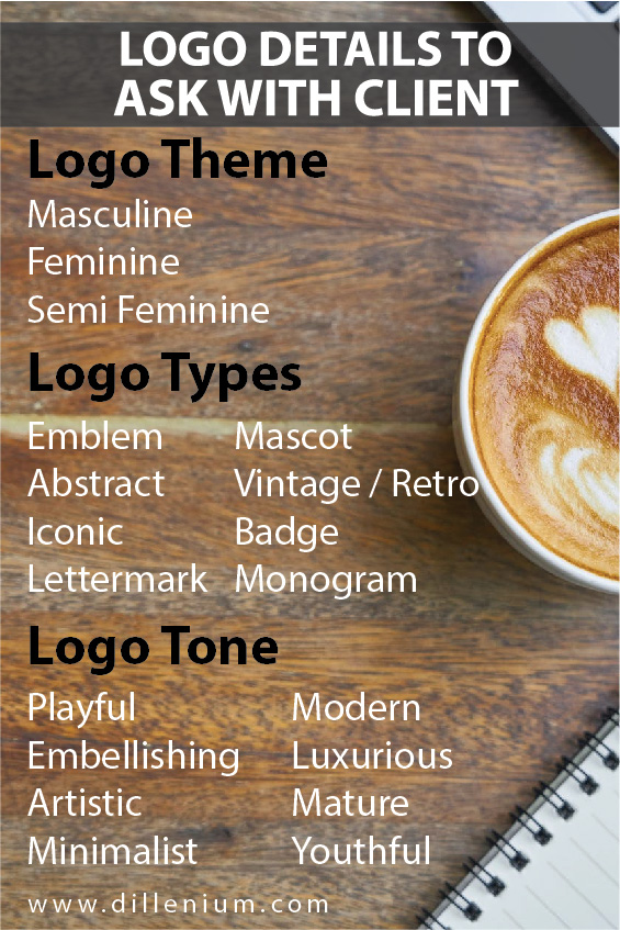
Understanding logotype is important to give it a true meaning through the letter mark, monogram, mascot, or any abstract and emblem design.
In the same way, logo gene recognition is also to make it easy for the target audience to relate the brand. Like; feminine, masculine, or semi feminine.
As a designer, I personally take care of all these things to incorporate in a design to make it more distinguishing for people to recognize the brand. As a matter of fact, simple – scalable – innovative, and relative logo design makes a powerful impact on business.
6) Master the Idea with Sketch
After getting all the details and master specifications for logo design, the visualization part comes up. And every designer sketches it on paper in multiple ways to choose the best.
For sketching, you don’t need to be a designer on paper. Just keep your rough concept on paper and draw it to give it a digital picture.
Many of my clients conceive their ideas and most of them shared a rough sketch so it becomes easier for a designer to understand the client’s requirement.
As a best practice, I want to share that we need to design something that can also relate to the client’s requirements. Many times it happens that you have something else in mind but the clients are thinking in another way so it’s a designer’s responsibility to tackle the design to deliver the best.
Sketching saves a lot of time and effort to create a perfect design digitally.
7) Make it Vector
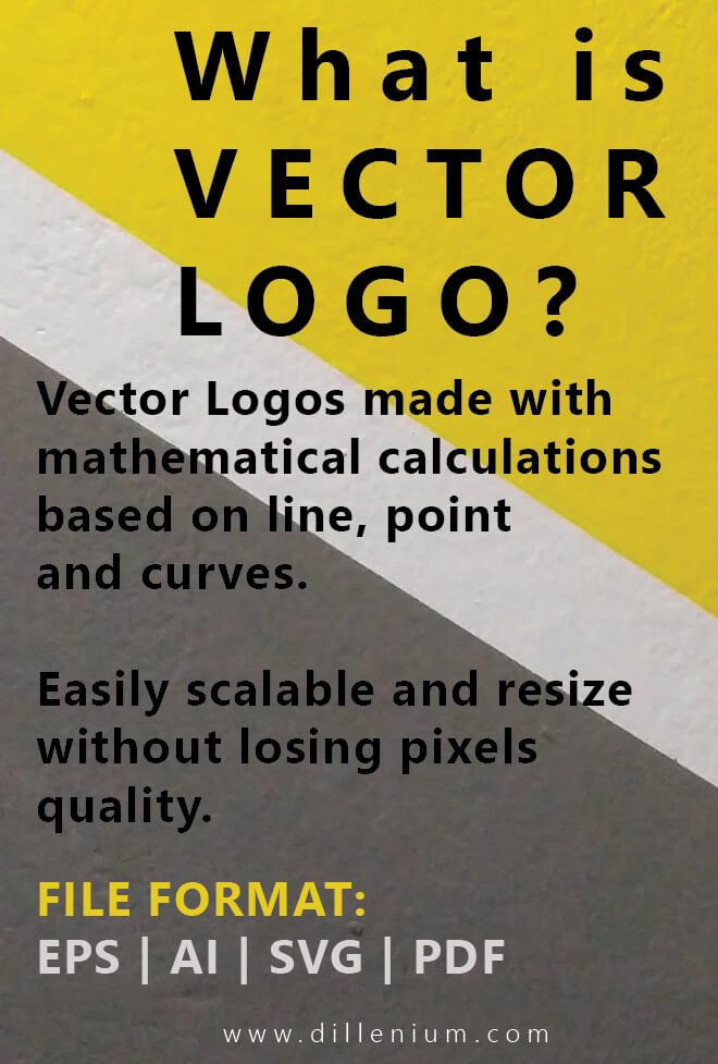
Your logo needs to be vector means it will scaleup to a higher degree without losing pixels quality. According to contemporary standards, your logo needs to be a vector that can easily resize and scalable to infinity.
8) Empower With Minimalist Design
Simple and minimalist designs are overwhelming for the target audience as compared to the hard and intricating design. Try to be simple and concise to show your business identity to the target audience.
Minimalism doesn’t refer to the design will be boring and colorless. It only shows a simple and classy look in an eye-catching manner to connect the customer.
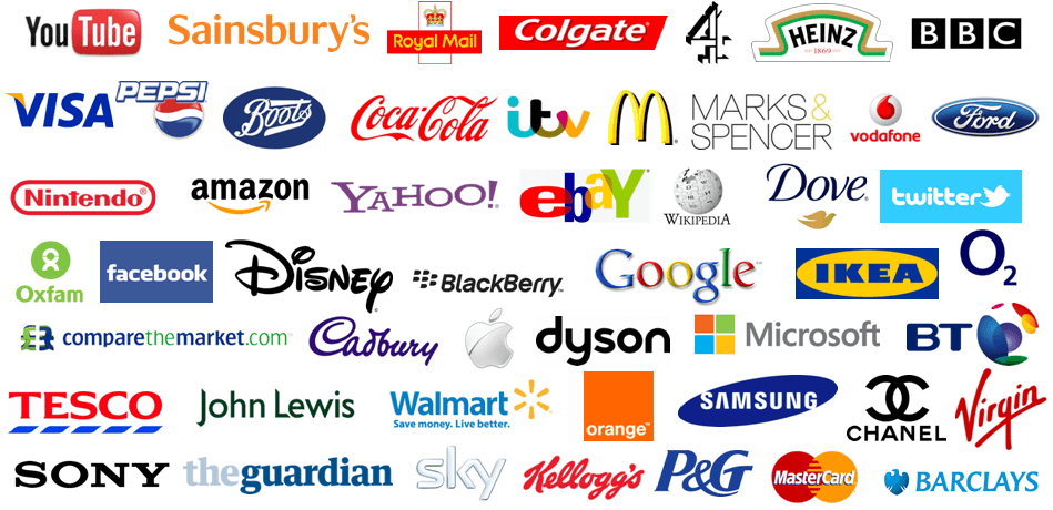
Take an example of Facebook, Twitter, and another big brand. All are simple and showing minimal designs to connect with people.
To create a perfect piece of minimalist design, you can simply play with typography and icon using one to two colors.
The best example of a minimalist logo design shows by Apple, Uber, Nike, Airbnb, and Zara.
9) Make it Unique
Make sure the design is absolutely ‘Unique’ and distinguishing among existing competitors. Never create a similar design version inspiring with the brand.
Be the original and keep your business unique and immaculate for the target audience. It will create a timeless impact on your business.
10) Be Creative
These days creativity is on the peak. You can play with the design concepts to make it simple and creative.
For this, many designers beautifully play with positive and negative spaces to display the concept that people love. Many designers on Dribbble showing their design main focus on the creative concepts.
Logo designing is not about just writing a beautiful font with the addition of an icon. It’s more about the designer creative thinking to wrap the typography and design in an artistic format that can significantly engage people.
Last year Spanish retailer ZARA rebrand the logo by playing with the spacing between the letters and it becomes a discussion on social media. Some designers think it shows over kerning to display the brand that makes it intricate for customers to recognize. While some designers take it positively and relate the over kerning to customer connection.
11) Focus on Timeless Design
Creating Timeless is a beauty!
Many of the logos created in the 60’s and ’70s are still giving a fresh feeling to the customers.
A timeless logo design will not be affected with time and keep the brand young and dynamic for generations.
Many people think that retro and vintage are the best examples of being timeless but there are many other examples of a simple, minimalist, and playful logo that gives a timeless vibe.
CocaCola brand is one of the best examples of being timeless within the logo design category. Spencerian script makes the brand demanding for its audience and still as young as it was.
12) Engaging Design Deliver More
So after a lot of understanding to make a perfect brand for the audience, one thing still important and need the concern to make it engaging to connect the customer for the long term. Macdonald, Pizzahut, Tim Horton, Starbucks are such names that we find every day.
So whatever you design, always make sure to make it for the audience that can get overwhelming responses.
SEE ALSO: 25 Illustrator Tutorials for Beginners
Let’s have a look at Logo Design Process
